WOW Slides Visualisation
With big environmental changes coming in the next 10 years, influencing people in organisations to adapt to change will become one of the most in-demand skills for future leaders.
When you think about the word ‘influence’, it’s a broad verb. Influence can be done through asserting authority, ‘politicking’, presenting etc.
There are four pillars in presentations that will get you the ‘YES’ you are looking for when making your pitch:
1. Structuring to pitch an idea
2. Visualising with slides
3. Layering style
4. Speaking spontaneously in Q&A
In the previous blog we have discussed about how to structure your presentation, the foundation of your pitch. For this blog we will discuss the next pillar which is visualising with slides.
For some people, this is the ‘fun’ part of presentation where you can choose from various templates that your slide app has. Visualising slides is more than just choosing slide templates.
To be an effective influence as a presenter, simply ‘telling’ your pitch is not enough. You need to ‘show’ your audience why they need to act and what the result looks like when they do.
This is why slide visualisation is important in helping you convey your meaning. Remember, slides are not just a place to put your script, or your bullet point prompts! Slides are meant to be seen, not read.
“Visual imagery is a powerful mnemonic tool that helps learning and increases retention compared to, say, witnessing someone read words off a screen.”
~ Garr Reynolds
But aren’t I already doing that now, you ask?
Let’s do a quick test, we say.
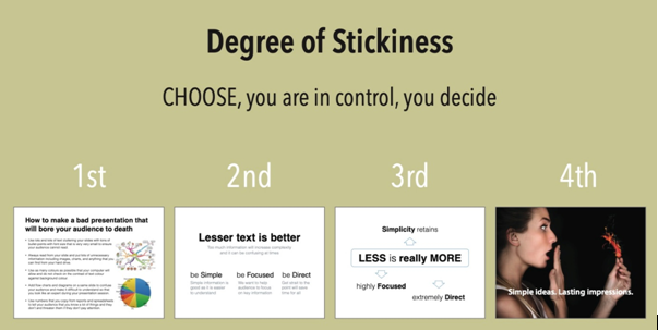
What degree of stickiness or WOW do your current slides have – 1st, 2nd, 3rd or 4th?
If yours look anything like the 3rd or 4th, you can stop reading now and move on to the next blog in the series. PRO TIP! You may consider a Masterclass or personal coaching with our specialist.
If yours looks like the 1st or the 2nd, you must continue reading.
You have taken the first step. Building confidence. How? In the first pillar you did 3 things.
• You fell out of love with your content.
• You found out what you needed to know about the audience.
• You structured the content to flow.
Now, you to need to build control. You want your audience to “listen” to you and “see” related key messages when we present. Not spend time “reading’ text. Your audience is an impatient lot with very short attention span. So, you need to think about how you can your body of work and transform it to simple, persuasive and exciting slides.
Insider Secret: Simple, persuasive and exciting slides is one ingredient in how to host engaging online events.
How to creatively complement content
Keep content simple.
Keeping content simple on slides is important. You want your audience’ sattention and focus to be on you. Small words or complex data on their computer or mobile screen is off-putting.
One key point per slide.
This is one of the quickest ways to keep your slides simple. Both you and your audience can stay focused and organised during the presentation The same applies to images. One image per slide and fill up the entire slide with just that one image.
Use XXXL sizes.
Guy Kawasaki recommends 30-point size. That’s the minimum requirement we recommend. Bigger is best. They are easier on the eyes. Bigger is also more exciting. You get extra impact without extra effort.
Less is More.
Truly! We know that virtual attention span is shorter than in-person communication. You can keep engagement high by changing what your audience sees more frequently, without distracting them. How? Have less content on each slide. Create more slides. Therefore, you will need to move to the next slide more often.
Reformat your slides for maximum visibility.
Most of the oft-used virtual platform defaults to the 16:9 format. However, depending on the delivery platform you are using and how you intend to present your slides, customise your slides to match. Then, your audience gets a great experience. If you present on multiple platforms, you may need several versions of your slides to fit each.
No more animations.
Even in Singapore internet bandwidth can be an issue. Animation can be a challenge in virtual presentations. Often, your audience will see a spasmodic presentation or a frozen screen because the internet’s bandwidth is not sufficiently strong to send animation sequences in real-time. The experience will be a bad one – for your audience. Remove animations for a cleaner, smoother, and more fluid audience experience.
These pointers can get you started with some significant results.
Easier said than done, you say. You may well be right. Creating sticky, WOW slides does take more time and effort. The question to ask yourself is if it’s worth it? What impact would presenting slides to your audience in a simple, persuasive and engaging manner have on you getting that ‘YES’, and your personal excellence and leadership presence?
The key mantra you need to remember is this:
visuals are for SEEing; NOT for READing
If you are a more advanced designer or user of visuals, contact us with your questions.
Advanced or newbie, move to our next blog for some ideas on Pillar 3.
Reference:
Spinning I.D.E.A.S: Integrated Design Exploration for Applied Stickiness, Ang Tian Teck.